A Gay and Magnificent Revel: Postmortem

Last September I decided that I wanted to learn how to build a VRChat world.  I had never made a VR project before, but I’ve been working in and around interactive entertainment since before the turn of the millennium, so I have Opinions, and plenty of them.

I wasn’t sure what sort of world I wanted to build; I have notes and outlines for various ideas I’ve had over time, but none of them seemed quite right.  And then, by happenstance, I reread The Masque of the Red Death, by Edgar Allan Poe, in particular his description of the prince’s imperial suite.  The image of that series of color-themed rooms, lit by giant braziers, was arresting to me. 
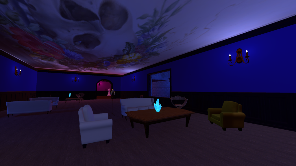
Also, at this particular moment in history, what could be a more appropriate inspiration for a VR world than a story about locking yourself up to hide from a plague and then throwing a big party with all your friends?

So I made a world. And having made one, I have some thoughts about what I tried to do, what went well, what did not go well, and what I regret. I thought I’d share them.

Aesthetic Principles

There were four primary things that I wanted to accomplish with my design:

  • First, I wanted to create a social space suitable for a party, with interesting places to hang out, and a mix of large spaces for the main party with smaller spaces for more private conversation. 
  • Second, as I’ve discussed elsewhere, I believe in the power of size in VR, and I wanted to use scale as a tool to create a certain gravity. 
  • Third, I wanted to employ the principle I identified in my favorite 3DOF experiences that there should be nowhere wrong to look
  • And fourth, I wanted to build it out of free assets, which was partly about an affection for free culture and partly about me being a cheapskate.

Things That Went Well

To begin with, I finished it, and it works, neither of which was a given.  It is sort of stunning looking back just how little I knew about anything.  I’d done some Unity tutorials, but I’d never shipped anything real.  I’m proud of myself for sticking with it through … a variety of setbacks.  About which more anon.

I also think overall, Revel is a pretty neat world.  There are lots of spaces to explore, lots of places to hang out with friends, and lots of odd things to look at.  (I want to take a moment to note that the Inexorable Orb *predates* the “orb contemplation” meme.  I got there first, damn it.)

I think I had some successes with scale.  The frescoes on the ceilings of the imperial suite are really cool, and the aforementioned Inexorable Orb works pretty well.  And I think I achieved some good effects with various objects that are a little uncanny on account of being unduly large.

I succeeded in using only free assets, which was at times an interesting challenge.  I had to search in all sorts of places to find things I wanted, which was an adventure in and of itself.

Things That Went Less Well

My biggest misstep was that I had not fully internalized the difference between assets that are designed for standalone PC games, and assets that are optimized for VR.  As a result, a lot of the assets I picked turned out to be enormous, and I wound up having to pare a lot of things back to get the world size down to something manageable.  My initial build was two and a half times as big as the final version is, and the final version is still larger than I would like it to be.

For this reason, I basically failed in my goal to fill the visual field with interesting things; I just didn’t have the polygon budget for it.  (It was also a challenge finding enough free and interesting assets to fill the space to the extent that I did.)  However, on reflection, I think filling the visual field is a less meaningful aesthetic principle in a six-degrees-of-freedom setting.  In a 360-degree film, things are happening on a fixed timeline; every moment the audience is looking at something uninteresting is a wasted moment.  But a VRChat world has as much time as the audience is willing to give it; as long as there’s enough interesting stuff in the space to keep people looking around, it’s OK if there are some relatively blank spaces.  (This may be less true of VRChat experiences on rails, like Magic Heist.)
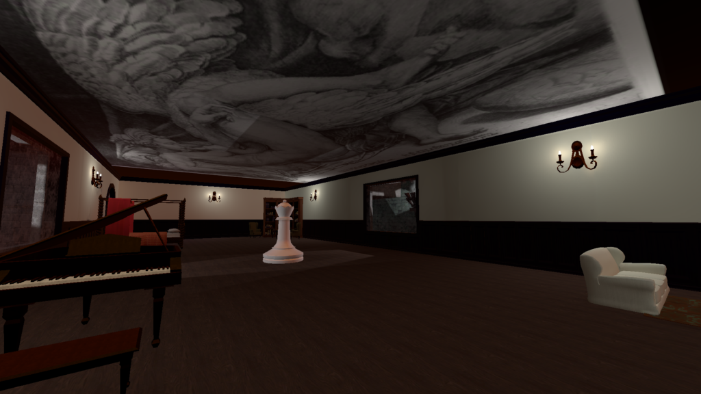
Relatively sparsely filled areas were helpful in another respect, namely my objective of creating spaces for private conversations.  I had not realized in advance that VRChat does not have audio occlusion, and so being on the other side of a wall from someone makes absolutely no difference in terms of being able to hear their conversation.  However, the abbey is large enough that the storerooms are sufficiently far from the rooms of the imperial suite that normal falloff will actually give you some privacy.

Although I had some successes with scale, it was much harder than I anticipated, for a couple of reasons.  First, scale turns out to be very hard to judge in the Unity editor.  Things regularly seem much larger or smaller in VR than they looked in the editor window.  I had to do a fairly significant rebuild when I realized I had made scale decisions that looked completely ridiculous in headset. (Another lesson: test in headset early and often.)  Second, my commitment to free assets (and my limited ability to create assets from scratch) made some scale efforts difficult; scaling objects up from what they were supposed to be sometimes works really well, but sometimes it just looks weird.

Regrets…I’ve Had A Few

A principle I believe is very useful in almost all parts of life is “Begin with the end in mind.”  I…did not employ that here.  I did a lot by the seat of my pants, in ways that were often ill-planned, and that caused me a lot of extra work.  (If we ever happen to be in the same room after I’ve had a few, ask me about the floors, and why I am a dumbass.)

I also did not think through some of the implications of my own ideas, and so despite my belief in the power of sound, I searched for music late in the process.  I wish I had started that early and allowed my soundtrack to inform more of my decisions along the way.

That said, both of these issues stem from the fact that I just did not know what I was doing, and was not in a position to solve problems before I knew I had them.  So I feel OK about it.  But I’ll do it differently next time.
Monumentality and VR (April 22, 2022)

In 2008, I drove a friend’s car across the country to their new home in Pittsburgh.  (It was very Kerouac, great experience.)  The bit of that trip that I remember best was my excursion off Route 66 to visit Barringer Meteor Crater, one of the best-preserved meteor craters in the world.  I drove for a surprisingly long time to get to the visitor center, then walked to the crater’s rim.  And beheld a really effing big hole in the ground. 

There were some telescopes on the observation deck, fixed in place, pointing at the crater floor, so I took a look.  There, through the lens, I saw a life-size cutout of an astronaut, which I thought was cute.  But when I looked without the telescope, it wasn’t there.  So I went back to the telescope to see if I could find some landmarks.  Then I looked again, and it still wasn’t there. And then I recognized a cluster of teeny tiny dots at the bottom of the crater.

Suddenly, I had this twisting feeling in my mind, like a dolly zoom inside my brain, as I realized just how completely I had misunderstood the scale of what I was looking at.  I remember the feeling to this day, that sense of wonder and that profound feeling that the world had things in it I had not previously been able to comprehend.

Psychologists call that feeling awe, and identify it by two features: it occurs in the presence of vastness, and it requires accommodation when you must adjust your mental frameworks to make sense of vastness.  That adjustment can be scary, and it can be exhilarating. It leaves you feeling changed, and often, more connected to others and the world as a whole. It is a tremendously powerful experience.

The awe of monumentality, however, has historically been difficult for the arts to evoke effectively. The form that has engaged with it the most is architecture, and while it has often succeeded magnificently, it is extremely expensive to build a cathedral. Furthermore, even when you do build something monumental, the experience is only available to those who live nearby or have sufficient resources to travel to it.

Other forms, meanwhile, can attempt to evoke monumentality, but the results are usually not nearly as successful. A photograph of the Grand Canyon, however brilliant, is a dim reflection.

Virtual reality, however, often succeeds in evoking the awe of monumentality, and accessibly so. An example I experienced recently was SPACEWALKERS, a brief documentary filmed outside the International Space Station, available free on the Meta Quest.  It is essentially ten minutes of wave after wave of awe as you realize, in new and surprising ways, holy shit, I’m in space.  It is amazing.

But the power of monumentality doesn’t have to be restricted to 360-degree film.  BRCvr, the virtual incarnation of Burning Man’s Black Rock City, uses the power of scale extensively to create a sense of liminality, to instruct the audience implicitly that now is the time to open your mind to the new.

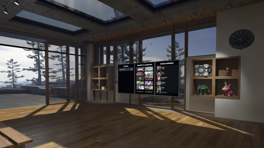
I think that the major VR platforms understand this.  Consider how many of the entry points for VR feature epic vistas, from Steam VR Home…

to Meta’s Home Environment for the Quest…

to VRChat’s default home.

Aside from monumentality’s pure aesthetic power, it can also offer useful tools for structuring emotional experiences, particularly in social VR.  Psychologists have found that experiences of awe tend to cause people to feel more connected to other people, and more inclined to help each other. One well-known example of this is the “overlook effect,” an experience that astronauts report when observing the Earth from orbit in which, as Edgar Mitchell, the sixth person on the moon, put it, “You develop an instant global consciousness, a people orientation, an intense dissatisfaction with the state of the world, and a compulsion to do something about it.” (A company called SpaceBuzz is in fact trying to replicate the overlook effect in VR.)

Most experiences of awe are not so potent, but even a small fraction of that empathogenic effect could have really profound applications for creators building experiences intended to bring people together, and to build relationships.

Monumentality does present certain logistical challenges, at least for experiences with six degrees of freedom. One of the frustrations of BRCvr is that it is such a large space, and it’s not always clear which elements are worth interacting with.  This can be a tedious experience, trekking across vast expanses to what winds up being no particular purpose.  I had a similar experience with some of the VRChat worlds that were part of last year’s Venice Biennale; they deployed scale effectively, creating a sense of grandeur and mystery, but then the actual pieces of interactivity were so far apart that the experience was dominated by the boring travel time between interesting bits.

Nonetheless, these are challenges worth undertaking.  Awe, in reality and virtuality alike, is a rare phenomenon, and sublime unlike anything else I know.  Monumental virtual constructs can deliver an emotional experience not easily available to most of us; its power to open our hearts to each other and to the world could be a powerful tool for creators of social VR experiences.

Affordances of Virtual Reality: Thoughts on VIFF Immersed 2020

Back in October I watched several of the XR offerings from the Vancouver International Film Festival Immersed exhibition, and I have been chewing on some thoughts. If the theme for my thoughts about the Biennale was tempo, the theme for VIFF was affordances.

Every medium has its particular qualities, things that it does and doesn’t do. These qualities offer a particular set of possibilities to a creator using the medium to communicate. Using these particular possibilities — the medium’s affordances — in an effective way is often key to creating good work. Works that exploit their medium’s affordances poorly may still be successful, but they do so despite themselves. There is an elegance to a work that uses its medium to the fullest, that could not have been implemented in any other medium.

XR is a young medium, and creators are still figuring out what its affordances are. Indeed, that process of learning is a lot of what makes this new medium exciting.

All of the pieces that were available to me on the Oculus Quest were three-degrees-of-freedom VR films. I think my takeaway from VIFF, and the Biennale before it, is that the essential affordance of 3DOF film is agency: the ability of the viewer to choose what to pay attention to, and how much attention to pay, within a set of interesting possibilities. The VIFF entries I watched were extremely uneven at exploiting this.

My favorite piece, easily, was Kowloon Forest. It describes itself as “a journey through the private lives of five strangers in Hong Kong,” but I think that doesn’t do it justice, because what made it really interesting to me was the way the piece was structured. Kowloon Forest is a series of vignettes shot in 360 degrees; each vignette places the viewer between two people or representations of people –a woman and her mirror, two friends, a man watching a mukbang video, and a man setting up a livestream. This meant that at every moment the viewer has two major loci of action to choose as their focus. Furthermore, each vignette took place in a really visually dense space, so there were ample things to look at in addition to the characters. I am always a sucker for that urban-palimpsest aesthetic that prevails in Hong Kong, but it is particularly well-suited to the 3DOF form. That visual richness, coupled with the feeling of discovery in exploring that space, was deeply satisfying.

Conversely, the most disappointing pieces were the ones that simply tried to replicate an existing form in VR. For example, Orpheus, a retelling of the myth of Orpheus and Eurydice, was essentially just a play with a proscenium stage, but modeled in computer-generated VR. There was a fully realized 360-degree environment, but none of it meant anything besides what was happening on the stage. (I understand from the blurb on the festival website that the full version of the performance involves some level of interactivity, but I don’t have any way to judge how that played out.)

I should concede that one can approach 3DOF as merely a dumb pipe to deliver more or less traditional theatre and film experiences. I think that’s legitimate, particularly in these times when traditional venues are unavailable, but I don’t think it’s very interesting. Also, the particularities of 3DOF are such that using it as a dumb pipe is perhaps more complicated than creators recognize.

The two Japanese-language pieces in the festival, GEIMU and VR Hero Sakura, illustrate this problem. Both are arguably merely ordinary films shot with a 180-degree camera. VR Hero Sakura is available in full on YouTube, and for my money not a lot is lost by watching it in a browser. Both pieces are about VR — they’re both stories of an immersive RPG gone wrong, but GEIMU aims for horror while VR Hero Sakura is comedy — but neither really tries to engage the distinctive affordances of the medium.

Translating conventional film techniques to 3DOF has unfortunate consequences for both pieces. Most obviously, close-ups shot at a distance appropriate to conventional film place the actor squarely inside the 3DOF viewer’s personal space, which is extremely uncomfortable. In GEIMU, that experience was effective, although I’m not sure if it was intentional. GEIMU tries to evoke a sense of horror and danger, and the perceived violation of my personal space served that end in a way that I’m not sure would have been possible in any other medium; even in live theatre I would have had the option to move back or otherwise react to the invasion of my space. In VR Hero Sakura, meanwhile, the invasion of my space was just off-putting. VR Hero Sakura also chose to place its subtitles into a space midway between the actors and the camera, which meant constantly refocusing between the text and the actors. This is tiring on the eyes, already a problem with VR headsets.

Similarly, neither piece did very much with the 180-degree field of vision. It’s not particularly useful to be able to look anywhere I want when the filmmakers have only given me one thing to look at. VR Hero Sakura in particular failed to take this opportunity in a way I still find baffling. One sequence, a melodramatic exchange between the protagonist and a monster, positions the viewer off to the side of the line between the two characters. The filmmakers decided to film this as alternating single shots. At any given moment, the character who’s not talking is not even within the 180-degree field of vision; you literally cannot look at them. What is the point of offering three degrees of freedom if you’re not going to let the viewer look at things that the story is telling them are interesting? 3DOF is a medium in which the viewer’s agency over their attention is the whole point; bringing in a filmmaker’s customary expectation of total control of the audience viewpoint is deeply counterproductive.

The documentaries in the program also mostly failed to exploit the affordances of 3DOF, largely for the same reasons the documentaries at the Biennale did: most of the time, there was one thing worth paying attention to, and then a lot of irrelevant things you could look at if you want. With the Wind and the Stars, for example, is an interesting documentary about a woman’s journey to launch her own airline, but I don’t think 3DOF adds much. The flying shots are fun in VR, and there are a couple of interesting moments when the camera is capturing semi-candid multi-person conversations, but mostly it’s interview material which is very single-point-of-focus.

Ecosphere: Raja Ampat had a different affordance challenge, which took me by surprise. The segment available to view online is about an ocean sanctuary in Indonesia, with a lot of underwater diving sequences, which initially seemed to me like a fantastic application of VR. What I had forgotten, however, is how much the current generation of VR headsets relies on the power of the human brain to interpolate sense data. I was using a Quest 1, and it just did not have the power to crisply convey hundreds of brilliantly colored, constantly moving fish. Everything seemed blurry and quickly tiring to watch, which wasn’t a problem for any of the other pieces aside from the previously mentioned subtitle issue.

By the Waters of Babylon was the best 3DOF documentary I’ve seen. It tells the story of a group of composers imprisoned at Theresienstadt during the Holocaust through the experiences of the Clarion Quartet performing a work by one of those composers, Viktor Ullmann, at Theresienstadt and elsewhere. The filmmakers really embraced the audience’s agency of attention, and the film combines live footage with computer-generated sequences that took excellent advantage of the expanded spaces that 3DOF can enable. A moment that the film returns to repeatedly as a sort of frame is a scene of the quartet playing the Ullmann piece. In a clever use of 3DOF, the quartet performs in a circle, with the viewer at the center. You can, at any point, choose which member of the quartet to watch, and none are the wrong choice. Similarly, there are several sequences that involve moving through the museum at Theresienstadt, which is an excellent application of the form; in those sorts of historical sites, everywhere and nowhere is the right place to look, and enabling the viewer to explore is perfect.

This, I think, is the hallmark of the 3DOF works that really work for me. Because the viewer can look anywhere, everywhere should be a good place to look, or should guide the viewer’s attention to a place that is. That’s a hard goal to achieve, but the works that do it achieve a level of engagement that is rare for me in a non-interactive medium.

Venice Biennale VR Expanded: observations on tempo

Last weekend I watched the 360-degree films (what they called 3DOF) that were part of the Venice Biennale VR Expanded exhibition. I have thoughts on a couple of topics.

The 3DOF works were available through a virtual exhibition hall within the VRChat platform, and I thought there were a lot of missed opportunities there. The experience began in a sort of antechamber where one could select a mask off of a table, and then board a gondola which whisks one away through a series of canals to the exhibition hall proper. The antechamber was nicely done, and I liked the masks; however, it struck me that one of VRChat’s more popular functions is the ability to pick up an entire new avatar inside a world, and it felt like if the designers wanted to go with a masquerade theme, they could have thought bigger.

I did not care for the gondola ride. It felt theme-parky, and the environment felt thin. It felt like it was signifying the Biennale’s home without representing it — gondolas! masks! canals! palazzos! There were several points at which I could see between the polygonal palazzos to an infinite expanse of water beyond, which was uncanny without even being surreal.

Eventually, the gondola arrived at the exhibition hall itself, which was minimalist. Essentially there was a dock for the gondola and some stairs, leading to a tasteful warehouse with a red carpet that pointed the attendee to a series of portals for each of the available pieces. I realize, on reflection, that I cannot remember seeing anything but the exhibition hall from the dock. In my memory the infinite expanse of water just goes to the horizon in all directions, which may illuminate the aforementioned uncanny feeling. I am reminded of Larry Niven’s description of hyperspace as a giant blind spot.

The other thing that was a bit offputting about the exhibition hall was that whenever I left one of the pieces, I respawned on the dock, not at the portal for the piece I had just left. I understand that this was probably technologically simplest; I’m not sure how hard it would be within VRChat to create that many different spawn points. Still, it disrupted the flow of the experience very effectively.

I did, however, very much enjoy the works being exhibited themselves. They were my first experience with 360-degree films, and there were all sorts of exciting formal novelties for me.

The most obvious difference between 360 films and regular films is the absence of the frame, and this has various downstream effects. It’s tricky to manipulate focus appropriately; on the one hand, you don’t want the viewer to miss important story information, but on the other hand if there’s only a single point of interest, what was the point of using 360? I thought several of the pieces that were centered around interviews were disappointing for this reason. What the subjects had to say was (mostly) interesting, but that was really all there was. I could look around, but why? It was a little interesting to experiment with placing the subject in different places within my field of view, but only a little. The freedom the format gave me to explore was basically useless, and actually distracting from what the creators appeared to be trying to do.

Conversely, while I really liked the fairy-tale-style adventure In The Land of the Flabby Schnook, I feel like I missed a lot of interesting environmental detail trying to keep up with the story. On at least two occasions I missed story developments because I was looking at some exciting bit of the world in the opposite direction.

The key, I think, is pacing. I thought Penggantian (“Replacements”) handled this really well. That piece is essentially a series of vignettes — almost snapshots, really — of a neighborhood in Jakarta spaced over decades, tracing the changes to one stretch of road. Very little really happened in any given segment, but because there was a limited time to look around and explore that static space, it felt like things were happening as I absorbed all of the things that had changed from the last segment. Furthermore, the pace of change was managed quite masterfully. In the early segments, very little changed. It felt slow and lazy, and even a little boring, which was appropriate to the point I think the filmmakers were trying to make about Jakarta’s transformations over the years. As it went on, however, more and more changed with each transition, and I felt increasing urgency to find all the interesting new details before they changed again. Then the second-to-last segment was relatively uncluttered, creating the sense of a pause and a moment to reflect. It was a really remarkable management of tempo for a piece with virtually no actual action.

4 Feet High also did a good job with pacing. Its story — a teenager adjusting to life at a new school — is conventional, but the filmmakers did a good job of adjusting the pace and style of the film to exploit the 360-degree format. At any moment, the story was focused on the main characters, but the pace of events was slow enough that I had time to glance around and explore the environment. The creators also did an excellent job of selecting visually interesting locations that rewarded those little excursions. I often had the feeling that I had missed something in the corner of my eye that would have been interesting, but wasn’t important; I think that feeling may be the sweet spot for this sort of pacing. The best environmental experiences have always made deft use of an inchoate sense of FOMO.

Another thing I thought 4 Feet High did well was its use of signposting. There are several moments during the film where animated effects appear, and to me they felt like small nudges indicating where I ought to orient my attention without demanding it. It was so gentle, and yet in combination with the pacing choices I think it was the only film in the exhibition where I never felt like I had made a poor choice about where to look.

I had very much the opposite experience with 1st Step. That piece adapted historical footage of the moon missions into an immersive environment. It is a really impressive technical achievement, but I felt almost constantly that I was looking in the wrong place, that the rocket was always behind me. The creators also seemed to like using fades to black, which had an almost diametrically opposed effect to what they do in traditional film. In a regular film, a fade to black is a pause, a moment to reflect on what you just saw; in the 360 environment, my instinct was invariably “crap, is something happening behind me? Did VRChat crash?”

It is, I think, a lesson of environment-oriented performances that one has to let go. There are so many possible interactions of viewer and viewed that a creator can’t control them all, and a viewer can’t encompass them all; you can only hope to channel the flocks of possibilities. The most successful works are the ones that roll with that truth, that point and nudge without trying to direct, that offer a buffet rather than a tasting menu.